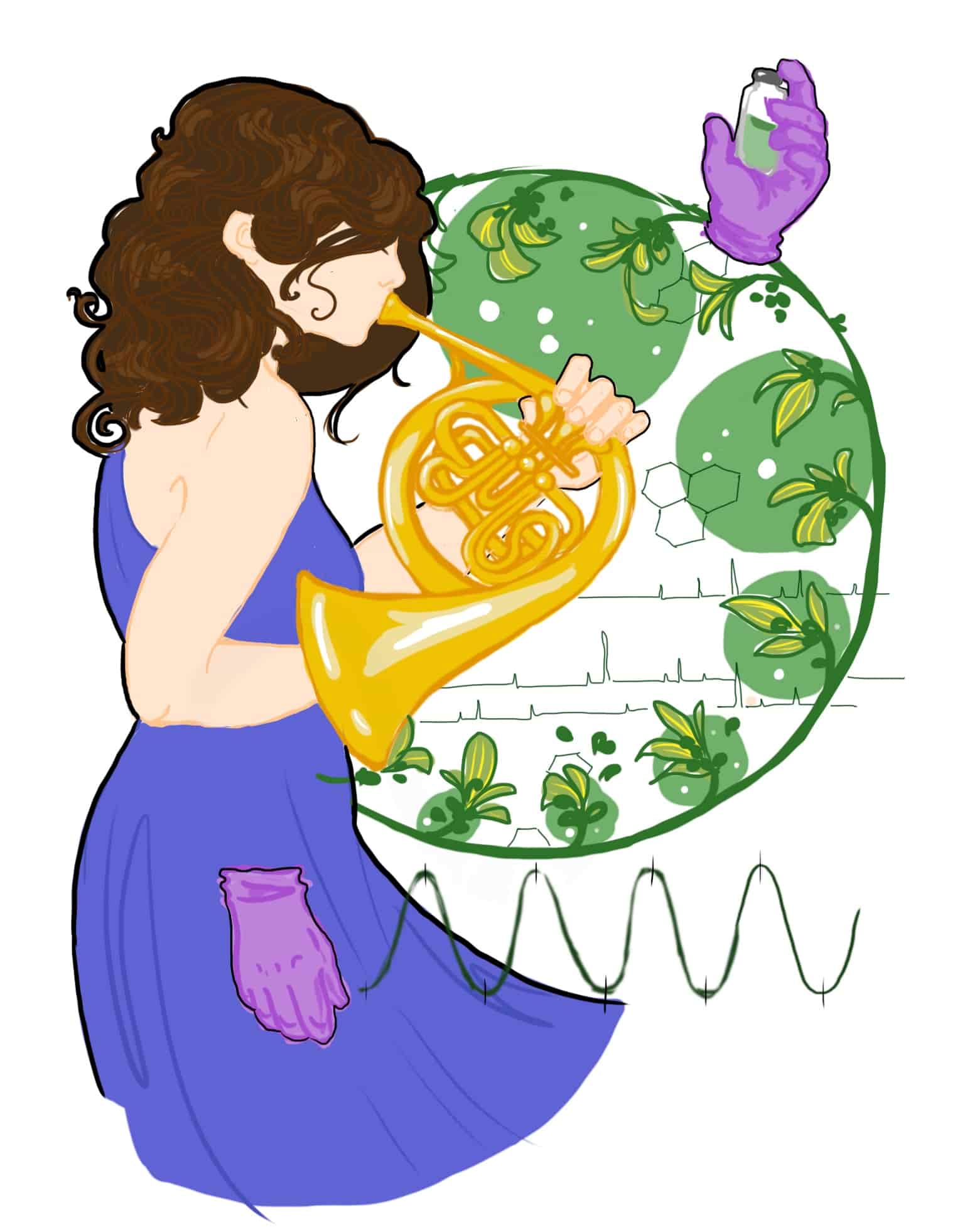
It often seems that we live in a polarized world: black and white, friend or foe, good and evil, positive and negative. This polarization bleeds into many aspects of society, such as our current view of arts and science as separate and opposite. Our universities place them in separate colleges, our government lauds the practicality of science and fails to give funds to the arts, and as children we are told that art “isn’t practical” and science and tech jobs are the more pragmatic path. We see caricatures of artists as overly boisterous and eccentric and scientists as cloistered lab rats, staring at their feet.
Yet this dichromatic thinking fails to capture the full extent of the human experience, and the full potential of both scientists and artists. Time and time again, the greatest scientists and artists have borrowed from these supposedly opposing worlds to forge answers and meaning to the plethora of questions our sentience produces. A classic example is that of color and color vision. Color, and the production and perception of color, has been approached over the years by both scientists and artists alike. These combined efforts have provided a range of information not only about how color is produced both in nature and synthetically, but also how color perception in humans and other animals influences emotions, behavior, and evolution. Studies on color span numerous scientific fields, such as optics, anatomy and physiology, anthropology, evolutionary biology, behavioral ecology, chemistry, mathematics, and visual psychology, but is also explored by the various fine arts, color theory in painting and photography, and lighting design in theatre, to name a few.
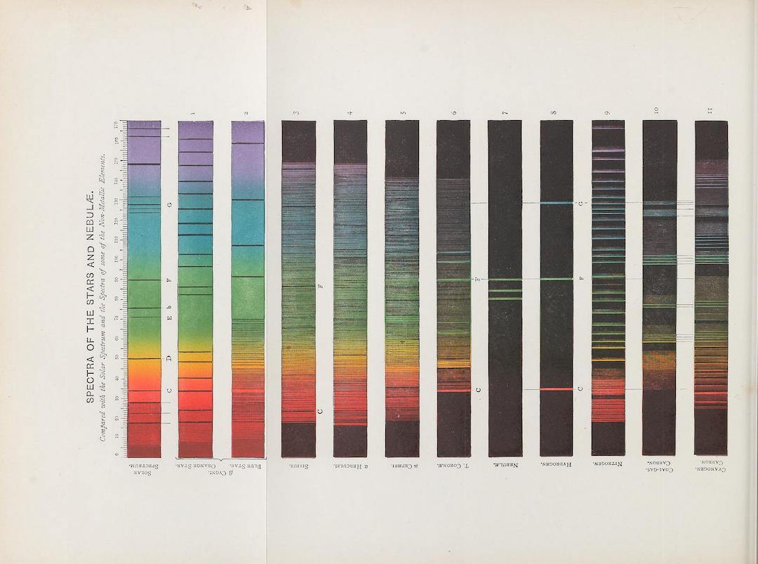
Work by Henry E. Roscoe showed how light emitted by various burning metals could be split into into its component colors.
Spectrum Analysis, Six Lectures Delivered in 1868 Before the Society of Apothecaries of London. Henry E. Roscoe and Sir Arthur Schuster, Smithsonian Libraries Collection
This article serves as a brief primer on color and color perception, as well as an overview of the relationship between color production and color perception, and the limitations of both. The purpose is to highlight a topic which has fascinated humans for centuries, and explore how knowledge obtained from both a scientific and artistic lens can work together to give rise to insight into our experience.
A Brief History of Color
When most people think of color, the first thing that comes to mind is the color wheel we were shown in elementary art class. This abstract representation is meant to show the relationships between certain colors in the wheel, and denotes the “primary”, “secondary”, and “tertiary” colors, which can be combined in various ways to create a broader spectrum.
What most people do not know is the vast history behind the color wheel and the discoveries which were integral to its invention and standardization.
The first color wheel was presented by Sir Isaac Newton in the 17th century when he first discovered the visible spectrum of light. Around this time, color was thought to be a product of the mixing of light and dark, with red being the “most light”, and blue the “most dark”. Newton saw that this theory was flawed, and while in isolation as the bubonic plague ravaged Europe, began testing the properties of white light and “to try therewith the celebrated Phenomena of Colour”. In his classic prism experiment, he noted that white light is composed of a variety of colors. He then mapped these colors into an octave schema as the first color wheel and the original ROY G BIV. His experimentations also led to the discovery that all secondary colors can be made by mixing primary colors. The mixtures of colors in varying ratios resulted in different “hues” of novel colors from the classic ROY G BIV baseline, and resulted in the first hue wheel, which is likely the color wheel we are most used to seeing.
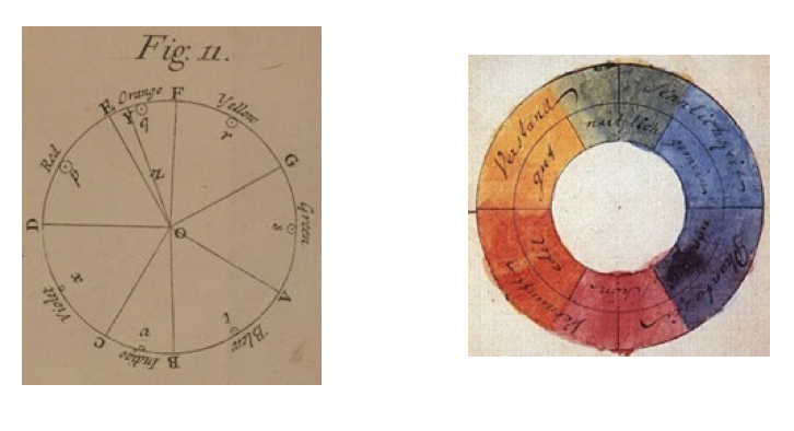
Right: Newton’s color wheel. Note the arrangement of the colors within the pattern of an octave. Left: Goethe’s color wheel.
Right: Isaac Newton, from Opticks: or, A Treatise of the Reflexions, Refractions, Inflexions and Colours of Light (London, 1704). Left: Wolfgang von Goethe, from Theory of Colours. 1810
Well after Newton’s publication of Opticks in 1704, Johann Wolfgang von Goethe began his own experiments with color. Like Newton, Goethe attempted to “conceive nature in her simplest, most conspicuous creations,” although he proposed to do so “without the aid of mathematics”. His experience as a painter and artist led to a fascination with the phenomena of color much like that of Newton’s, though he fervently disagreed with Newton’s idea that darkness was just an absence of light. Instead, he insisted that darkness was an active ingredient in the production of color. This questioning of the science behind Newton’s discovery led many to believe him to be an opponent of the sciences in general. However, Goethe himself claimed that “nobody can appreciate [mathematics] more highly than I,” but that “to understand the phenomena of color nothing is required but unbiased observation and a sound head”. Strikingly, Goethe’s investigation of color mirrored that of Newton’s. The 1810 publication Theory of Colours, although not strictly scientific, was monumental in its breadth of data and investigation. Goethe conducted numerous experiments with color to address the gaps he perceived in Newton’s theory, a holistically scientific approach similar to the rigor of Newton’s prism experiments. Perhaps due to his background in poetry and the arts, Goethe also went into detail about the psychological aspects of colors and their relationship to human emotions and behavioral traits. He especially hoped that his investigation would aid painting, which he deemed “an art which has the power of producing on a flat surface, a much more perfect visible world than the actual one can be”. His work was also in part a contemplation of the effects of light and dark on human color perception, such as the way in which ratios of light and dark produce differences in the color spectra. These observations led Goethe to develop his own color wheel, which is more akin to the one we use today. In his wheel, colors opposite each other have a visually antagonistic role. Surprisingly, this observation later became the foundation for our knowledge of how color is interpreted by the human brain.
Two more aspects of color were expanded upon by the research of American painter Alfred Munsell in the early 20th century. As a teacher, Munsell recognized the usefulness of a systematic method for communicating and teaching color. This required a system where color was easily measurable and definable, a system which was missing from arts education. To achieve this, Munsell added the dimensions of “chroma” and “color value” as additions to hue. Chroma is the purity or intensity of the color, and is now referred to as saturation. Color value refers to the lightness or darkness of the color, and is now referred to as value or brightness. These dimensions now defined the 3D “color space”, represented by Munsell’s tree with color value as the y-axis, chroma as the x-axis, and hue as the z-axis, He also defined a standardized method of notating specific colors within this space. Variations in these properties are set up within a 3-dimensional graph space, and a precise color can be relayed by naming its specific coordinates. For example, 5PB 5/1 refers to Purple-Blue 5 with a value of 5 and a saturation of 1. This “color space” is still used for not only arts education, as Munsell had intended, but also in the field of optics and color mathematics.
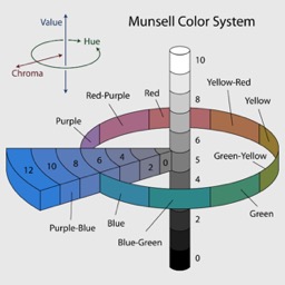
Munsell’s color tree. Notice how the vertical axis displays color brightness and the horizontal axis shows color saturation, or chroma. The circle around the verticl axis represents hue.
Jacob Rus, 2007
The work of these men, as well as many other men and women, led to the standardized color wheel and color space that are now used across arts, science, and mathematics in a multitude of color research. Their approaches, both scientific and artistic, set the foundation for studies of color for generations to come. Color production is still standardized by hue, value, and saturation, which have important implications for such things as production of paints and dyes and coding of pixels in televisions for specific colors. Color perception used the fundamentals of Goethe’s Theory of Color to further investigate the role of color in psychology, ecology, and evolution, as well as the physiology of human sight and color discernment.
These artists and scientists both desired to explore the nature of color in their own mediums, and only through the synergy of their research can understanding the fundamental human experience of color vision move forward. As famous color theorist Josef Albers said, “Ah, the creative process is the same secret in science as it is in art. They are all the same absolutely.”


